Ever since I learned about it, I’ve wanted to use the entity component system (ECS) pattern to make games. Used properly, the pattern leads to clean, effective, and in my opinion cool-looking code. So when I was getting started my game engine, I looked for an ECS library that to build off of. And I found plenty.
The Haxe community is prolific and enthusiastic, releasing all kinds of libraries completely for free. That’s great, but it’s also a bit of a problem. Instead of working together to build a few high-quality libraries, everyone decided to reinvent the wheel.
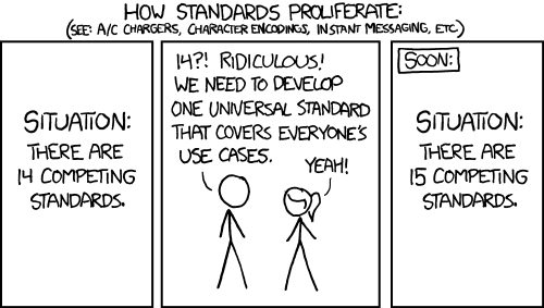
It did occur to me that I was preparing to reinvent the wheel, but no one had built a game engine capable of what I wanted, so I went ahead with it. Eventually I realized that’s probably what all the other developers were thinking too. Maybe there’s a reason for the chaos.
Let’s take a look at (eleven of) the available frameworks. What distinguishes each one?
Or if you want to see the one I settled on, skip to Echoes.
Ash
Let’s start at the beginning. Ash was one of the first ECS frameworks for Haxe, ported from an ActionScript 3 library of the same name. Makes sense: Haxe was originally based on AS3, and most of the early developers came from there.
Richard Lord, who developed the AS3 version, also wrote some useful blog posts on what an ECS architecture is and why you might want to use it.
Objectively, Ash is a well-designed engine. However, it’s held back by having started in ActionScript. Good design decisions there (such as using linked list nodes for performance) became unnecessary in Haxe, but the port still kept them in an effort to change as little as possible. This means it takes a bunch of typing to do anything.
//You have to define a "Node" to indicate which components you're looking for; in this case Position and Motion.
class MovementNode extends Node<MovementNode>
{
    public var position:Position;
    public var motion:Motion;
}
//Then systems use this node to find matching entities.
private function updateNode(node:MovementNode, time:Float):Void
{
    var position:Position = node.position;
    var motion:Motion = node.motion;

    position = node.position;
    motion = node.motion;
    position.position.x += motion.velocity.x * time;
    position.position.y += motion.velocity.y * time;
    //...
}
It honestly isn’t that bad for one example, but extra typing adds up.
ECX
ECX seems to be focused on performance, though I can’t confirm or debunk this.
As far as usability goes, it’s one step better than Ash. You can define a collection of entities (called a “Family” instead of a “Node”) in a single line of code, right next to the function that uses it. Much better organized.
class MovementSystem extends System {
    //Define a family.
    var _entities:Family<Transform, Renderable>;
    override function update() {
        //Iterate through all entities in the family.
        for(entity in _entities) {
            trace(entity.transform);
            trace(entity.renderable);
        }
    }
}
Eskimo
Eskimo is the programmer’s third attempt at a framework, and it shows in the features available. You can have entirely separate groups of entities, as if they existed in different worlds, so they’ll never accidentally interact. It can notify you when any entity gains or loses components (and you can choose which components you want to be notified of). Like in ECX, you can create a collection of components (here called a View rather than a Family) in a single line of code:
var viewab = new View([ComponentA, ComponentB], entities);
for (entity in viewb.entities) {
    trace('Entity id: ${entity.id}');
    trace(entity.get(ComponentB).int);
}
The framework has plenty of flaws, but its most notable feature is the complete lack of macros. Macros are a powerful feature in Haxe that allow you to run code at compile time, which makes programming easier and may save time when the game is running.
Lacking macros (as well as the “different worlds” thing I mentioned) slows Eskimo down, and makes it so you have to type out more code. Not as much code as in Ash, but it’s still inconvenient.
Honestly, though, I’m just impressed. Building an ECS framework without macros is an achievement, even though the framework suffers for it. Every single one of the other frameworks on this list uses macros, for syntax sugar if nothing else. Even Ash uses a few macros, despite coming from AS3 (which has no macros).
edge
edge (all lowercase) brings an amazing new piece of syntax sugar:
class UpdateMovement implements ISystem {
    function update(pos:Position, vel:Velocity) {
        pos.x += vel.vx,
        pos.y += vel.vy;
    }
}
You no longer have to create a View yourself, or iterate through that view, or type out entity.get(Position) every time you want to access the Position component. Instead, just define an update function with the components you want. edge will automatically give you each entity’s position and velocity. You don’t even have to call entity.get(Position) or anything; that’s already done. This saves a lot of typing when you have a lot of systems to write.
edge also provides most of the other features I’ve mentioned so far. Like in Eskimo, you can separate entities into different “worlds” (called Engines), and you can receive notifications when entities gain or lose components. You can access Views if needed/preferred, and it only takes a line of code to set up. Its “World” and “Phase” classes are a great way to organize systems, and the guiding principles are pretty much exactly how I think the ECS pattern should work.
Have I gushed enough about this framework yet? Because it’s pretty great. Just one small problem.
A system’s update function must be named update. A single class can only have one function with a given name. Therefore, each system can only have one update function. If you want to update two different groups of entities, you need two entire systems. So the syntax sugar doesn’t actually save that much typing, because you have to type out an entire new class declaration for each function.
Eventually, the creator abandoned edge to work on edge 2. This addresses the “one function per system” problem, though sadly in its current state it loses all the convenience edge offered. (And the lack of documentation makes me think it was abandoned midway.)
Baldrick
Baldrick is notable because it was created specifically in response to edge. Let’s look at the creator’s complaints, to see what others care about.
• It requires `thx.core`, which pulls a lot of code I don’t need
That’s totally fair. Unnecessary dependencies are annoying.
• It hasn’t been updated in a long time, and has been superceded by the author by edge2
It’s always concerning when you see a library hasn’t been updated in a while. This could mean it’s complete, but usually it means it’s abandoned, and who knows if any bugs will be fixed. I don’t consider this a deal-breaker myself, nor do I think edge 2 supersedes it (yet).
• Does a little bit too much behind-the-scenes with macros (ex: auto-creating views based on update function parameters)
Oh come on, macros are great! And the “auto-creating views” feature is edge’s best innovation.
• Always fully processes macros, even if display is defined (when using completion), slowing down completion
I never even thought about this, but now that they mention it, I have to agree. It’s a small but significant oversight.
• Isn’t under my control so isn’t easily extendable for my personal uses
It’s… open source. You can make a copy that you control, and (optionally) submit your changes back to the main project. If the original project isn’t abandoned, they’ll usually accept your contributions. (And if it is abandoned, then you can just tell people to use your fork.)
• Components and resources are stored in an `IntMap` (rather than a `StringMap` like in edge)
This is actually describing what Baldrick does, but it still mentions something edge does wrong. StringMap isn’t terrible, but Baldrick’s IntMap makes a lot more sense.
Anyway, Baldrick looks well-built, and it’s building on a solid foundation, but unfortunately it’s (quite intentionally) missing the syntax sugar that I liked so much.
var movingEntities:View<{pos:Position, vel:Velocity}> = new View();

public function process():Void {
    for(entity in positionEntities) {
        entity.data.pos.x += entity.data.vel.x;
        entity.data.pos.y += entity.data.vel.y;
    }
}
That seems like more typing than needed – entity.data.pos.x? Compare that to edge, which only requires you to type pos.x. I suppose it could be worse, but that doesn’t mean I’d want to use it.
Oh, and as far as I can tell, there’s no way to get delta time. That’s inconvenient.
exp-ecs
Short for “experimental entity component system,” exp-ecs is inspired by Ash but makes better use of Haxe. It does rely on several tink libraries (comparable to edge’s dependency on thx.core). The code looks pretty familiar by now, albeit cleaner than average:
@:nodes var nodes:Node<Position, Velocity>;

override function update(dt:Float) {
    for(node in nodes) {
        node.position.x += node.velocity.x * dt;
        node.position.y += node.velocity.y * dt;
    }
}
Not bad, even if it isn’t edge.
Under the hood, it looks like component tracking is slower than needed. tink_core’s signals are neat and all, but the way they’re used here means every time a component is added, the entity will be checked against every node in existence.
Ok, I just realized how bad that explanation probably was, so please enjoy this dramatization of real events instead, featuring workers at a hypothetical entity factory:
Worker A: Ok B, we just added a Position component. Since each node needs to know which entities have which components, we need to notify them.
Worker B: On it! Here’s a node for entities with Hitboxes; does it need to be notified?
Worker A: Nope, the entity doesn’t have a Hitbox.
Worker B: Ok, here’s a node that looks for Acceleration and Velocity; does it need to be notified?
Worker A: No, the entity doesn’t have Acceleration. (It has a Velocity, but that isn’t enough.)
Worker B: Next is a node that looks for Velocity and Position; does it need to be notified?
Worker A: Yes! The entity has both Velocity and Position.
Worker B: Here’s a node that needs both Position and Appearance; does it need to be notified?
Worker A: No, this is an invisible entity, lacking an Appearance. (It has a Position, but that isn’t enough.)
Worker B: Ok, next is a node for entities with Names; does it need to be notified?
Worker A: It would, but it already knows the entity’s Name. No change here.
Worker B: Next, we have…
This process continues for a while, and most of it is totally unnecessary. We just added a Position component, so why are we wasting time checking dozens or hundreds of nodes that don’t care about Position? None of them will have changed. Sadly, exp-ecs just doesn’t have any way to keep track. It probably doesn’t matter for most games, but in big enough projects it could add up.
(Please note that exp-ecs isn’t the only framework with this issue, it’s just the one I checked to be sure. I suspect the majority do the same thing.)
On the plus side, I have to compliment the code structure. There’s no ECS framework in existence whose code can be understood at a glance, but in my opinion exp-ecs comes close. (Oh, and the coding style seems to perfectly match my own, a coincidence that’s never happened before. There was always at least one small difference. So that’s neat.)
Cog
Cog is derived from exp-ecs, and calls itself a “Bring Your Own Entity” framework. You’re supposed to integrate the Components class into your own Entity class (and you can call your class whatever you like), and now your class acts like an entity. I don’t buy it. Essentially their Components class is the Entity class, they’re just trying to hide it.
As far as functionality, it unsurprisingly looks a lot like exp-ecs:
@:nodes var movers:Node<position, velocity>;
override public function step(dt:Float) {
    super.step(dt);
    for (node in movers) {
        node.position.x += node.velocity.x * dt;
        node.position.y += node.velocity.y * dt;
    }
}
I was pleasantly surprised to note that it has component events (the notifications I talked about for Eskimo and edge). If Cog had existed when I started building Runaway, I would have seriously considered using it. In the end I’d probably have rejected it for lack of syntax sugar, but only barely.
Awe
Awe is a pseudo-port of Artemis, an ECS framework written in Java. I’m not going to dig deep into it, because this is the example code:
var world = World.build({
    systems: [new InputSystem(), new MovementSystem(), new RenderSystem(), new GravitySystem()],
    components: [Input, Position, Velocity, Acceleration, Gravity, Follow],
    expectedEntityCount: ...
});
var playerArchetype = Archetype.build(Input, Position, Velocity, Acceleration, Gravity);
var player = world.createEntityFromArchetype(playerArchetype);
Java has a reputation for being verbose, and this certainly lives up to that. I can look past long method names, but I can’t abide by having to list out every component in advance, nor having to count entities in advance, nor having to define each entity’s components when you create that entity. What if the situation changes and you need new components? Just create a whole new entity I guess? This engine simply isn’t for programmers like me.
That said, the README hints at something excellent that I haven’t seen elsewhere…
@Packed This is a component that can be represented by bytes, thus doesn’t have any fields whose type is not primitive.
…efficient data storage. With all the restrictions imposed above, I bet it takes up amazingly little memory. Sadly this all comes at the cost of flexibility. It reminds me of a particle system, packing data tightly, operating on a set number of particles, and defining the limits of the particles’ capabilities in advance.
OSIS
OSIS combines entities, components, systems, and network support. The networking is optional, but imposes a limitation of 64 component types that applies no matter what. (I’ve definitely already exceeded that.) I don’t have the time or expertise to discuss the can of worms that is networking, so I’ll leave it aside.
Also notable is the claim that the library “avoids magic.” That means nothing happens automatically, and all the syntax sugar is gone:
var entitySet:EntitySet;

public override function init()
    entitySet = em.getEntitySet([CPosition, CMonster]);

public override function loop()
{
    entitySet.applyChanges();

    for(entity in entitySet.entities)
    {
        var pos = entity.get(CPosition);
        pos.x += 0.1;
    }
}
I have to admit this is surprisingly concise, and the source code seems well-written. The framework also includes less-common features like component events and entity worlds (this time called “EntityManagers”).
I still like my syntax sugar, I need more than 64 components, and I don’t need networking, so this isn’t the library for me.
GASM
According to lib.haxe.org, GASM is the most popular haxe library with the “ecs” tag. However, I am an ECS purist, and as its README states:
Note that ECS purists will not consider this a proper ECS framework, since components contain the logic instead of systems. If you are writing a complex RPG or MMO, proper ECS might be worth looking in to, but for more typical small scale web or mobile projects I think having logic in components is preferable.
Listen, if it doesn’t have systems, then don’t call it “ECS.” Call it “EC” or something.
It seems to be a well-built library, better-supported than almost anything else on this list. However, I’m not interested in entities and components without systems, so I chose to keep looking.
Ok, so what did I go with?
Echoes
Echoes’ original creator described it as a practice project, created to “learn the power of macros.” Inspired by several others on the list, it ticked almost every single one of my boxes.
It has syntax sugar like edge’s (minus the “one function per system” restriction), no thx or tink dependencies, yes component events, convenient system organization, and a boatload of flexibility. Despite deepcake’s (the creator’s) modesty, this framework has a lot to it. It received 400+ commits even before I arrived, and is now over 500. (Not a guarantee of quality, but it certainly doesn’t hurt.)
Echoes’ performance
I haven’t seriously tested Echoes’ speed, but deepcake (the original dev) made speed a priority, and I can tell that it does several things right. It uses IntMap to store components, it keeps track of which views care about which components (meaning it’s the first one I’m sure doesn’t suffer from the problem I dramatized in the exp-ecs section), and it does not let you separate entities into “worlds.” It’s a shame that it lacks that last feature, but on the other hand I haven’t needed worlds yet, and they do incur a performance hit.
Echoes’ flexible components
Let’s talk about how components work. In every other framework I’ve discussed thus far, a component must be a class, and it must extend or implement either “Component” or “IComponent,” respectively. There’s a very specific reason for these restrictions, but they still get in the way.
For instance, say you wanted to work with an existing library, such as—oh, I don’t know—Away3D. Suppose that Away3D had a neat little Mesh class, representing a 3D model that can be rendered onscreen. Suppose you wanted an entity to have a Mesh component. Well, Mesh already extends another class and cannot extend Component. It can implement IComponent, but that’s inconvenient, and you’d have to edit Mesh.hx. (Which falls squarely in the category of “edits you shouldn’t have to make.”) Your best bet is to create your own MeshComponent class that wraps Mesh, and that’s just a lot of extra typing.
In Echoes, almost any Haxe type can be a component. That Mesh? Valid complement, no extending or implementing necessary. An abstract type? Yep, it just works. That anonymous structure? Well, not directly, but you can wrap it in an abstract type. Or if wrapping it in an abstract is too much work, make a typedef for it. (Note: typedefs don’t work in deepcake’s build, but they were the very first thing I added, specifically because wrapping things in abstracts is too much work.)
All this is accomplished through some slightly questionable macro magic. Echoes generates a lot of extra classes as a means of data storage. For instance, Position components would be stored in a class named ContainerOfPosition. Echoes does this both to get around the “extend or implement” restriction, and because it assumes that it’ll make lookups faster. This may well be true (as long as the compiler is half-decent), it’s just very unusual.
Echoes: conclusion
I settled on Echoes for the syntax sugar and the component events. At the time, the deciding factor was component events, and I hadn’t realized any other libraries offered those. So… whoops.
I don’t regret my choice, at all. The syntax sugar is great, abstract/typedef support is crucial, and the strange-seeming design decisions hold up better than I first thought.
Addendum: ecso
ecso (whose name is always written in monospace font) is a promising addition to the Haxe ECS ecosystem. Unlike all the other libraries, this one is a compiler plugin, meaning it modifies the behavior of Haxe itself, which theoretically makes it faster to compile.
It’s a well-thought-out library, offering most of the features I want to see in an ECS framework. The main thing it’s missing is component events. The dev initially expressed interest in adding them, so I figured I’d hold off on reviewing ecso until that happened. Sadly, the library hasn’t been updated in a while, so I decided to write a short review.
As it stands now, ecso is a solid option if you want a simpler alternative to Echoes and don’t care about component events. In particular, ecso tries to provide as much transparency as possible. Its API really is only four functions long, and those functions do nothing more or less than what their names suggest. It turns out that four functions really are enough, as long as you’re willing to track and schedule everything. For better or worse, there’s no inversion of control here.